Home > Transformation Preview > New Look
Updated Look
Since late 2023 the presenation and the brand identity for Plus value Awareness was updated.
This webpage explains in summary
Historical context
More than 20 years ago the project director began to incorporate creativity in developing awareness projects and activities. At the time creativity was not embraced in awareness projects.
Then when plus value awareness began in 2015 the awareness direction changed with information incorporated into creative art and visual imagery in a marketing approach from 2016 onwards.
There have been a couple of redesigns in 2018 and 2021 however the awareness environment has become more imaginative online on social media and video and an increasing creative awareness environment that has developed elsewhere, "Plus Value Awareness" cannot stay behind.
The changes have been made after an evaluation of the way the projects and the presentation are made related to delivering its objective for those with hidden differences along with communities and Society.
The updated identity was also made to prevent legal challenges after a major transportation operator in Europe had redesigned its identity to a presentation too similar to Plus Value Awareness.
Change of approach with an updated identity
The expectation on how projects are communicated and presented has increased dramatically within recent years. However, it is also important to be bold and unique to stand out from all other awareness projects and organisations.
Summary
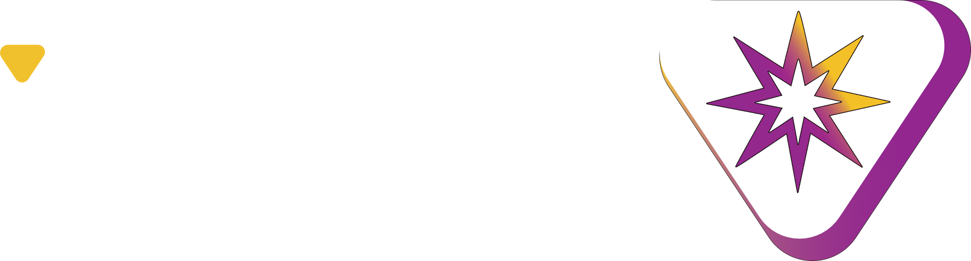
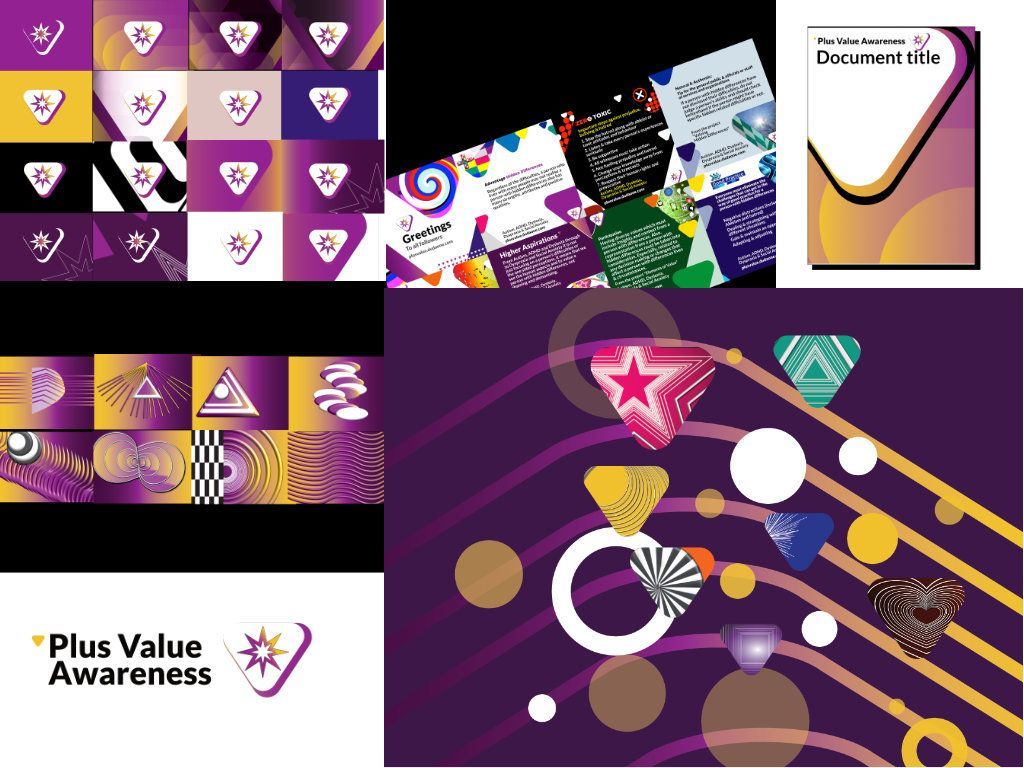
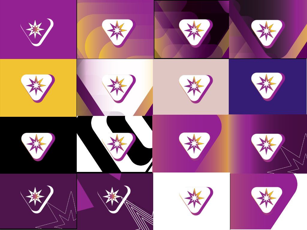
The new identity retains the guiding star symbol but it is presented within a new curved triangle shape as a stylised "V" shape to represent value.
As well as being used as part of the updated main identity, the value curved triangle shape will be visually used consistently across different materials, locations online & on social media. This is part of a unified look as part of a different approach to a social enterprise proposal. Further details to be confined at a later date
Colour & typeface changes
Through research how colour is presented can affect a person's confidence in accessing information websites documents and digital formats. From the research findings, it was decided that the colour palette would change to improve legibility and confidence.
The primary colour scheme is now chained to magenta and golden yellow. In addition, a family of secondary colours is made.
As well as a new brand identity, an updated unified look with the online features and connected projects.
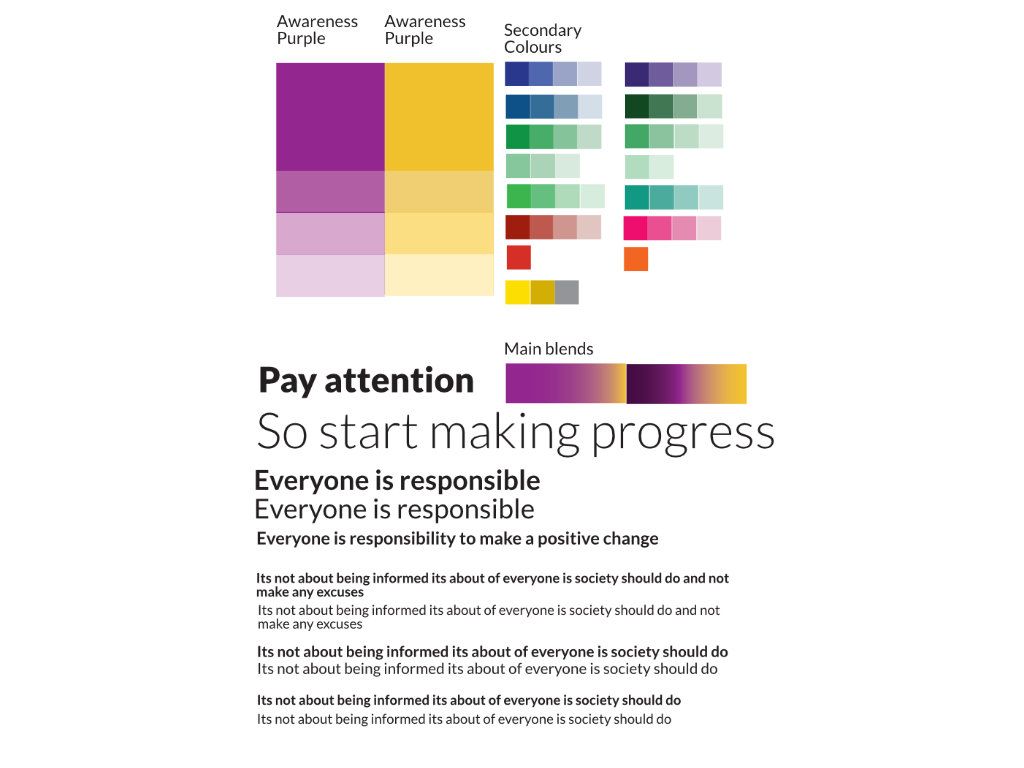
Modified colours
After feedback on how some of the awareness features were made online including customised for specific difficulties and diverse backgrounds. Because colour coding is not very encouraged between specific difficulties a decision has been made to replace it by developing a series of expressive visual imagery that incorporates abstract shapes and a background of visual effects. This will affect the online features understanding series awareness focus and customised versions of existing projects for specific difficulties and diverse backgrounds.
Change of typeface
As part of an updated brand identity, a change of the main typeface with Lato font, replacing Open Sans. The updated font is being rolled out on a gradual basis. The changes has been made to maximise the message to generate appeal on the information presented. After 8 years of using the previous font a refresh was needed to generate new kinds to energy and enthusiasm to value and embrace hidden differences without appear too tiring and predictable. As part of the rollout of the updated look each web page on this website will be converting to the new typeface with new minimal standards to improve legibility. This incluldes a minimum size will be increase to 20 points with titles and subheading be a larger size. Because of the detailed specification the updated changes will be developed on a gradual basis and can take several months until every webpage is converted to the new minimal legibility standards.
Keep updated via Social Media and here on the transformation section of this website.
Flexible use of typefonts
Related to projects and online features aimed at the general public and focused sections of society a flexible used of typefaces to maximise the impact on the awareness message. You will start to notice this soon for a fothcoming project "Senses". Also coming soon a new family audience focused features and social media stories & video where flexible use of typefaces and colours will be used a headline awareness messages. This will specifically be aimed at young people, adults with specific ambitous background and lifestyle. Also for multicultral communites and the general public. The expanded changes are important to maximise the appeal and to gets its message across to everyone. Watch out for developments via social media and the update blog on wordpress.
Higher Aspirations
The new changes are also made after specific comments that the fundamental elements generate interest.
Since 2015 "A positive Sense of Value" has been used as the tagline to value hidden differences beyond understanding and acceptance. However, after receiving feedback that the current approach was misleading and did not enable people to change how everyone treats hidden differences in Society. To make sure the message gets across effectively a simple tagline change was not enough, a concept and a series of ethical vision was needed to represent what "plus value awareness" is all about and also generate interest in communities and societies which enables the point and issues featured on the plus value awareness initiative. This leads to the beginning of Higher Aspirations. This presents an overview of encouraging to start opening people's minds and exploring projects and information based on the fundamentals. A special creative identity has been used and it's presented as a mini introductory feature and a fundamental campaign and tagline. In the long term higher aspirations will be displayed as a marketing encouragement in communities and in different parts of society to change perceptions and presumptions.
Visit the special "Higher Aspirations" page to explore.
Visual language
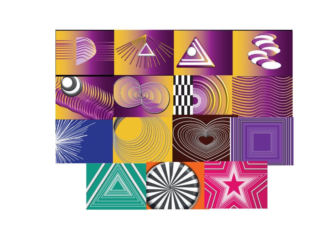
A series of value language of expressions this incorporates a series of visual shapes and short abstracts Patten's and shapes. The new family of visual imagery is an expansion of the updated identity.
How will it be used
The visual expressions visual design is used openly for general project pages and the new marketing and mini online feature "Higher Aspirations". Also a family of short visual patterns will be used for specific purposes as part of a forthcoming online feature which will incorporate the information and projects from the Understanding Series and Awareness Focus pages.
Online appearance changes
With the exception of Primary projects and the specific Projects linked with the features Differences Originals and Diverse Differences, all other projects online will have a unified look.
Watch out for developments via social media and the update blog on wordpress.
As well as the new look there will be some improvements and some changes to this website
Visit the transformation page to discover more
Social media
The updated will be phased-in on the Plus Value Awareness profiles on Facebook, Twitter & Inatagram.
A new style cover templates with a new profile image.
Flexible profile image
The updated style profile image will have a flexible twist. As well the main brand identiy, it will change frequenly with a flexible identity symbol with different visual imagery. This could be related to projects, campaigns, features along with other examples linked with life experences, events, seasons, occasions and to show support to different awareness events.
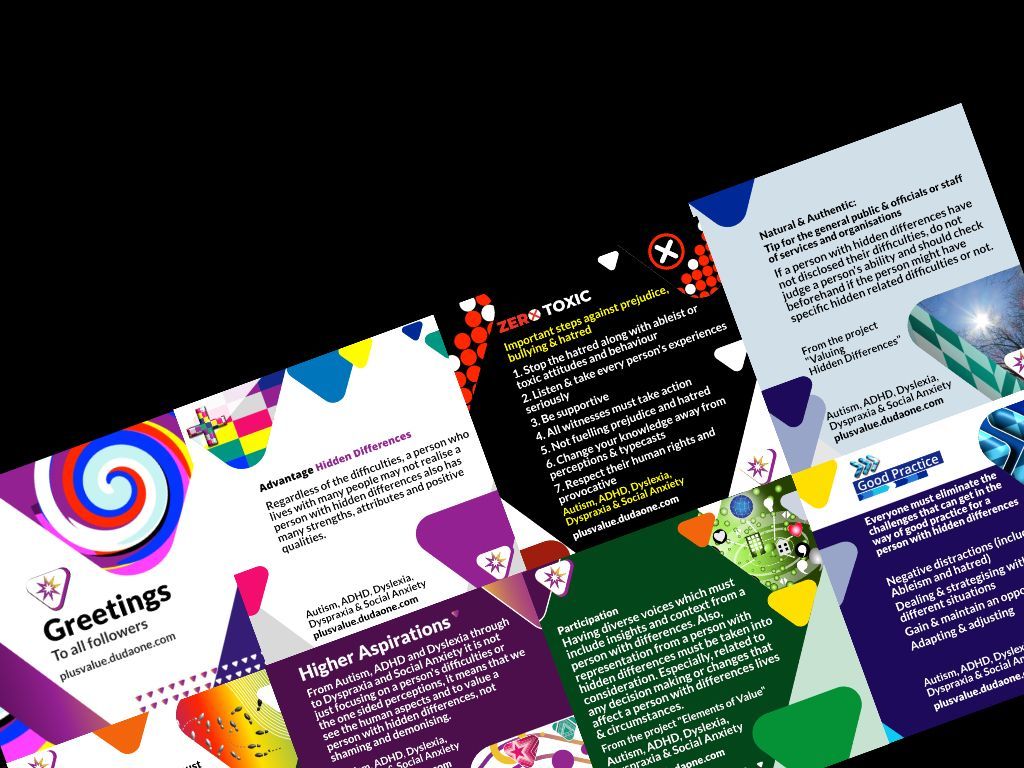
Status templates
The templates used for status & posts will recive a major makeover with a more flexible and more colourful look. It will contain extracts of projects, features and campaigns with over 300 templates have been developed.
Social media stories coming soon
The examples from the status templates will appear regualrly soon as stories with customised version from the profile page.
Connect templates
Updated version of the connect templates with greetings messages will feature the new look.
As well as greetings messages it will expanded to short messages such as new week ahead, midweek, new month & new season (linked with northern heimsphere countries) New versions will appear on a gradual basis.
Higher Aspirations
A new family of posts templates, linked with the new mini feature and as a new tagline. This will provides background of valuing hidden differences with new lowdown information extracts against myths and pressumptions.
Differences Originals on Facebook
A updated look will also appear there. As well as specialised featured on Plus Value Awareness, this profile it will be the exclusive home of legacy projects since 2000. It will continue to feature extacts from supported awareness events.