New look
Brand identity
Now Active
A number of changes affecting some of the projects & features online
Slideshow example

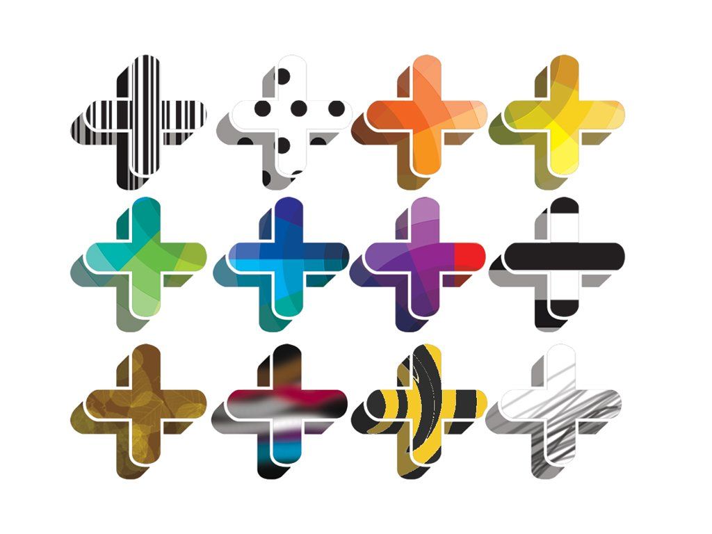

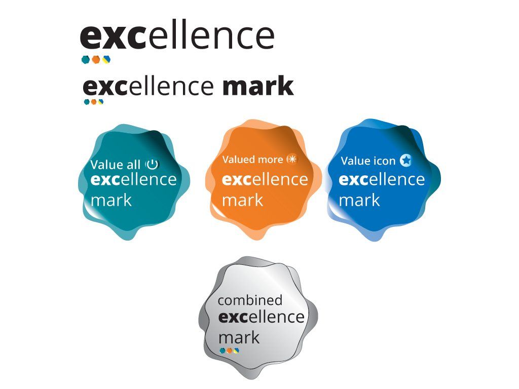
The new branding presentation including the main identity is designed to making the identity more visually flexible depending on different materials & platforms. It consists of the new updated identity symbol, flexi circle shape and the curve steps shape.
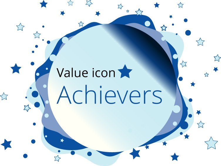
Main identity
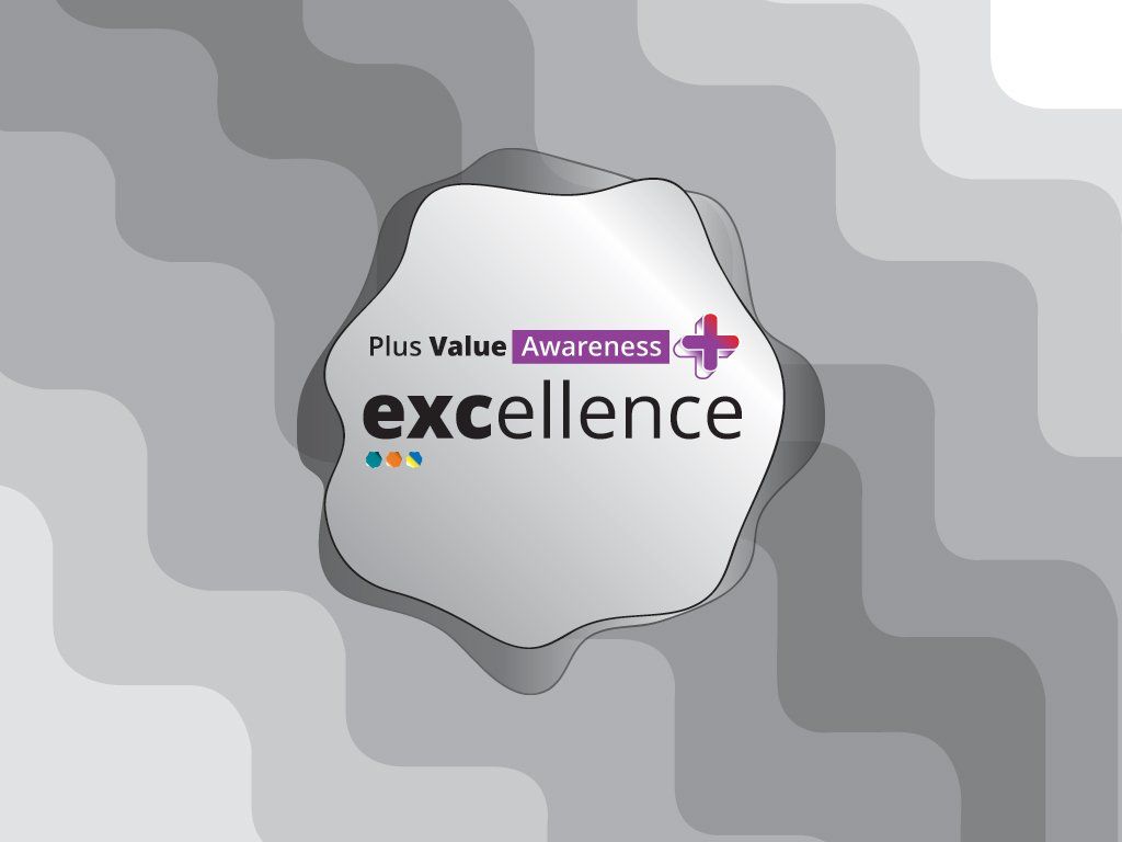
The emphasis is to move away from the clinical or medical aspects. So the redesgined plus symbol is transformed as a 3-dimensional concept which is presented more flexible with a combined of visual images within the symbol. This including visual elements of the featured projects through to generic and specific visual imagery. It can be displayed on its own or with the identity name.
The aim is to show a less formal or a restrictive look and to emphasise positivity in empowering individuals with hidden differences and to promote a smarter sense of value.
The flexibility is also depends on communication and the output and where the awareness inititaive is communicated to.
To increase flexibility curved shape is used on occasions as a background of the main identity along with the primary and special awareness feature brands. The curve shapes are used specifically for specific content and depending on space and format & platform.
Keep up to date on the developments by folowwing Plus Value Awareness on social media